
The vowel space
Vowels can be tricky to describe phonetically because they are points, or rather areas, within a continuous space. Any language will have a certain finite number of contrasting vowels, each of which may be represented with a discrete alphabetic symbol; but phonetically each will correspond to a range of typical values, and between any two actual vowel sounds there is a gradient continuum.
A good analogy can be made with colour. Here is the widely-used chromaticity diagram of the Commission International de L’Eclairage (CIE):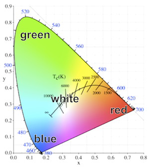 The rounded V-shape of the diagram defines the perimeter of perceptible colour, running between three ‘corner’ colours, red, green and blue. There is a continuous space between these three colours, and also between the corner trio and the central area corresponding to white.
Similarly, the vowel space can be diagrammed as a rounded V-shape with three ‘corner’ vowels, namely i, a, u. There is a continuous space between these three vowels, and also between the corner trio and the ‘colourless’ central area corresponding to schwa. Schematically: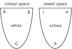 Languages make different categorizations of both the colour space and the vowel space. For instance, many languages (eg Vietnamese) have a single word to cover the part of the colour space which English divides into green and blue. On the other hand, English has only one basic term blue for a space which Russian and Italian divide into two: Russian sinij and Italian blu correspond to what English has to call ‘dark blue’ while goluboj and azzurro correspond to ‘light blue’. Similarly with vowel categorizations: the part of the vowel space where Japanese and Spanish have only e is divided by Italian and Yoruba into two, namely e and ɛ.
The triangularity of the chromaticity diagram reflects the three kinds of photoreceptors (cones) in the retina, which respond differently to different parts of the visible spectrum. The triangularity of the vowel space reflects our sensitivity to different patterns in the acoustic spectrum: u is characterized by resonances (also called formants) in the lower part of the vowel range, a by resonances in the mid range, and i by a combination of high and low resonances.
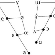
The two-dimensional colour space diagram is derived in a rather complex manner, but a two-dimensional vowel space diagram can be created fairly simply by plotting the lowest resonance (also called the ‘first formant’ or ‘F1’) against the second-lowest resonance (also called the ‘second formant’ or ‘F2’). Here are the primary cardinal vowels as recorded by Daniel Jones and John Wells:
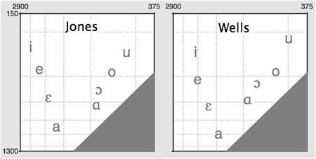 (F1 is plotted from top to bottom, F2 from right to left; the scales are logarithmic, and the numbers are frequency values in Hertz. The bottom right corner is greyed out because, by definition, F1 may not be higher than F2.)
The broadly triangular shape of the vowel space is evident for both speakers, though their absolute values differ. These discrepancies are due partly to natural differences in the size and shape of the speakers’ vocal tracts, and partly to variations in the precise realizations of the sounds: John’s [u], for instance, is rather extreme.
Today it’s remarkably straightforward to produce such plots from sound recordings. Thanks to technological developments and the public-spirited work of brilliant scientist-programmers like Paul Boersma and Mark Huckvale, many wonderful apps are freely available. Boersma’s industry-standard Praat can be downloaded for free in versions for both Mac and PC.
Early phoneticians were not so lucky. Unable to measure actual speech sounds, they were thrown back on whatever visual and tactile (or ‘proprioceptive’) impressions they could gain of what the body was doing to produce the sounds. One of the great pioneers was Alexander Melville Bell, father of the telephone’s inventor Alexander Graham Bell (father and son gave phonetic lecture-demonstrations at UCL in the mid-nineteenth century). Bell had the idea of describing vowels in terms of associated tongue configurations.
Bell classified vowels in terms of two dimensions, based on his estimation of how high or low the tongue was positioned, and how front or back in the mouth. Before long, phoneticians had widely adopted this view of the vowel space as a tongue space, and even today Bell’s terms high/low and front/back are in general use as vowel classifiers. (This is also why we conventionally plot the F1 minimum at the top of the vowel space, this resonance tending to be inversely related to estimated tongue height.)
However, as Peter Ladefoged puts it in his Vowels and Consonants:
These early phoneticians were much like astronomers before Galileo… [who] thought that the sun went round the earth every 24 hours, and that most stars did the same… The observations of the early astronomers were wonderful. They could predict the apparent movements of the planets fairly well. These astronomers were certain they were describing how the stars and planets went around the earth. But they were not. The same is true of the early phoneticians. They thought they were describing the highest point of the tongue, but they were not. They were actually describing formant frequencies.
As early as 1928, American speech scientist George Oscar Russell published an x-ray study which undermined the notion of the vowel space as a tongue space. In Russell’s words, “phoneticians are thinking in terms of acoustic fact, and using physiological fantasy to express the idea”.
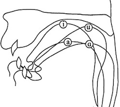
So it may come as a slight shock to be reminded that the International Phonetic Association still promulgates the ‘pre-Galilean’ view of the vowel space as a tongue space. The Handbook of the IPA (Cambridge University Press, 1999) begins its section on vowels with this cross-section of the vocal tract
 and explains that
joining the circles representing the highest point of the tongue in these four extreme vowels gives the boundary of the space within which vowels can be produced. For the purposes of vowel description this space can be stylized as the quadrilateral [on the IPA chart]
The Handbook concedes that, in order to gauge intermediate positions between these tongue extremities, it’s necessary to listen to the actual sounds. This follows Daniel Jones, whose Outline of English Phonetics (9th ed., 1960) refers vaguely to the “resonance chambers” which determine vowel quality, and states for the primary cardinal vowels that
the degrees of acoustic separation between each vowel and the next are equal, or, rather, as nearly equal as it is possible for a person with a well-trained ear to make them.
Interestingly, Ladefoged tells us in his informal CV that
Jones never defined what he meant by saying that the cardinal vowels were acoustically equidistant. He thought that the tongue made equal movements between each of them, even after the publication of x-ray views of the 8 primary cardinal vowels produced by his colleague Stephen Jones [no relative] showed that this was not the case (Jones, 1929). Daniel Jones himself published photographs of only four of his own cardinal vowels, although, as he told me in 1955, he had photographs of all 8 vowels. When I asked him why he had not published the other four photographs, he smiled and said ‘People would have found them too confusing’.
The IPA Handbook prefers to talk of “abstraction”:
The use of auditory spacing in the definition of these vowels means vowel description is not based purely on articulation, and is one reason why the vowel quadrilateral must be regarded as an abstraction and not a direct mapping of tongue position.
Nonetheless, the obsolete articulatory view of the vowel space is still presented to students with depressing regularity.
So Daniel Jones’s primary cardinal vowels [i e ɛ a ɑ ɔ o u] simply mapped the outline of the auditory-acoustic vowel space, the articulation of this outline requiring complex adjustments of the jaw, tongue and the lips.
The articulatory view led to the invention of the so-called ‘secondary cardinal vowels’ – the primary cardinals articulated with reversed lip positions. The plotting of these on the periphery of the quadrilateral means that the lips are factored out of the diagram. This reduces it to a tongue space, and eliminates the auditory-acoustic underpinnings which had motivated it (overtly or not) in the first place.
It is this tongue space (albeit stylized or ‘abstract’) which is perpetuated on the IPA chart: any point on it indicates an articulation which can be either rounded or unrounded. From the acoustic point of view, this doesn’t make sense: if you change a vowel’s lip posture then you change the sound, and therefore its position in acoustic space. In particular, if you reverse the lip positions of the primary cardinal vowels, the resultant sounds are all centralized – except for [ɒ], which is an acoustically peripheral vowel somewhere between [ɑ] and [ɔ].
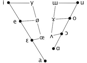
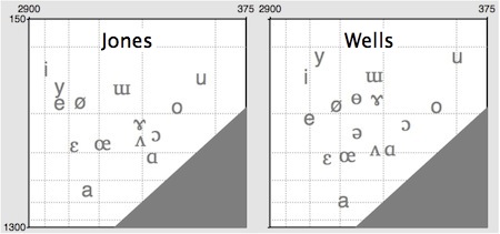
Here again are the Jones and Wells acoustic vowel spaces, plotted as before by means of Praat’s Vowel Editor, but now augmented with some additional vowels to show how they fill out the space within the periphery defined by the primary cardinals:
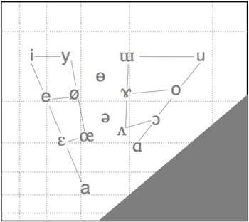
 According to the first sentence of the IPA Handbook, the aim of the Association is “to promote the study of the science of phonetics and the various practical applications of that science.” In that spirit, I thought it might be worth sketching out a vowel chart based on acoustic science rather than “physiological fantasy”. By averaging Jones’s and Wells’s formant values, and then adjusting these to interpret fairly literally Jones’s notion of acoustic equidistance, I came up with a tentative set of values which can be plotted as follows (with some connecting lines as a visual aid):
The Praat Vowel Editor can generate basic synthetic vowels at any point on the chart. If you click on the symbols in the chart above, you will hear a synthesized vowel with the corresponding F1 and F2 values. (For each vowel, I have also used the Editor to make appropriate adjustments to the higher resonances F3 and F4. While F1 and F2 are adequate for differentiating the vowels on the chart, higher formants make syntheses more natural, F3 making a particular contribution to the auditory “rounding” of the closer front vowels.)
In principle, much higher-quality, genuinely natural-sounding syntheses could be produced for these (or other) qualities, providing standardized objective reference vowels, much as the colours of traffic and aviation signals are given standardized chromaticity specifications. Speech synthesis allows reliable equidistant spacing, and such reference vowels could replace the inevitably variable vowel demonstrations which have been recorded by different phoneticians from Jones onwards. Note that it is the shape of the space – roughly, the ratios of the formant values – which matters more than precise absolute frequencies; the space could be normalized and adjusted to synthesize female or child speech.
Here I have tried to stylize the acoustic space into a chart on the model of the IPA’s quadrilateral; again, clicking on the symbols gives syntheses generated by the Praat Vowel Editor.
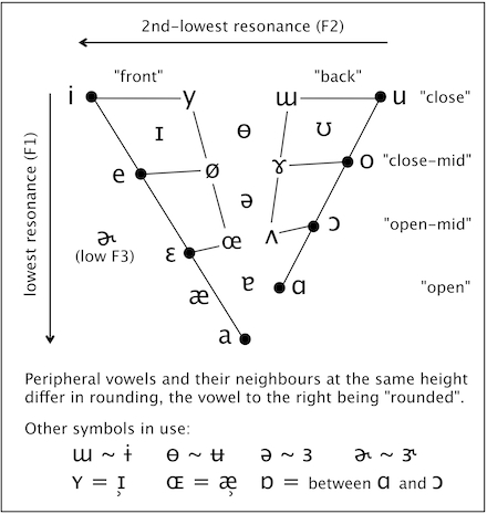
The chart is pretty conservative. It maintains (indeed, to some extent it explains) the three parameters of “height” (or closeness), “backness” and “rounding” which all phoneticians and phonologists make use of. The black dots preserve Jones’s eight primary cardinal vowels, equally spaced on the “front” and “back” sides of the periphery. The colourless vowel schwa is still located mid-centre.
The triangularity of the vowel space is made clear. Most languages have triangular systems; Spanish, for example, has a classic five-vowel system with three corner vowels which are somewhat centralized versions of the reference/cardinal vowels i, a and u on the chart. A clearly four-cornered system like that of Finnish (with i–æ–ɑ–u) is still revealed as such on the chart.
There is a deliberate ambiguity in the situation of a on the chart. By means of connecting lines, I have preserved Jones’s allocation of a to the “front” series of cardinal vowels. But a is located centrally, below schwa. And many languages treat their single open vowel as belonging to the phonologically “back” category. The front/back ambiguity of a could be enshrined explicitly by the addition of a connecting line to the “back” series.
I’ve made slight changes to the interpretation of a few symbols. These have the general effect of reducing the number of distinct qualities, so that several symbols which have distinct definitions on the IPA chart are treated here as notational variants. These changes are mostly optional (ie the chart could be re-populated if desired), but I do think that the official IPA chart is crowded with symbols which exist not so much for good acoustic or linguistic reasons as to fill the slots implied by its tongue-space framework.
For instance, I’m not sure that languages ever contrast ɨ and ɯ; the unrounded close non-front vowel of languages like Turkish and Vietnamese is sometimes transcribed as ɯ and sometimes as ɨ. However, languages do seem to make use of a somewhat close, somewhat rounded vowel which is neither y nor u – for instance, the “compressed u” of Swedish and Japanese, the Scottish FOOT-GOOSE vowel and the “fronted” FOOT of Southern BrE. For this quality it seems reasonable to use ɵ/ʉ, and my synthesized vowel is based on the formants of John Wells’s demo of IPA ɵ.
Lastly, I’ve added the rhotic vowel ɚ, which is acoustically distinct from ə mainly in terms of its lowered third resonance (F3). It would be easy to turn the above chart into a three-dimensional vowel space with F1, F2 and F3 as its axes: each vowel could be perched on a “stick” the height of which would correspond to F3. ɚ could be included in such a space, its stick standing close to that of ə but considerably less tall than any of the other vowels’ sticks. However, the added visual complication hardly seems worth the trouble for a practical chart, so I’ve kept the space two-dimensional, and kept ɚ off it, to one side.
